Easter at Rock Point
This Easter brand project centered on creating a cohesive, welcoming visual system to support the season across multiple touch points. The creative approach balanced modern design with clarity, using intentional typography, color, and messaging to communicate the heart of Easter in an accessible way. Each piece was designed to bring people in without feeling overwhelming, resulting in a unified and thoughtful brand experience for Easter.
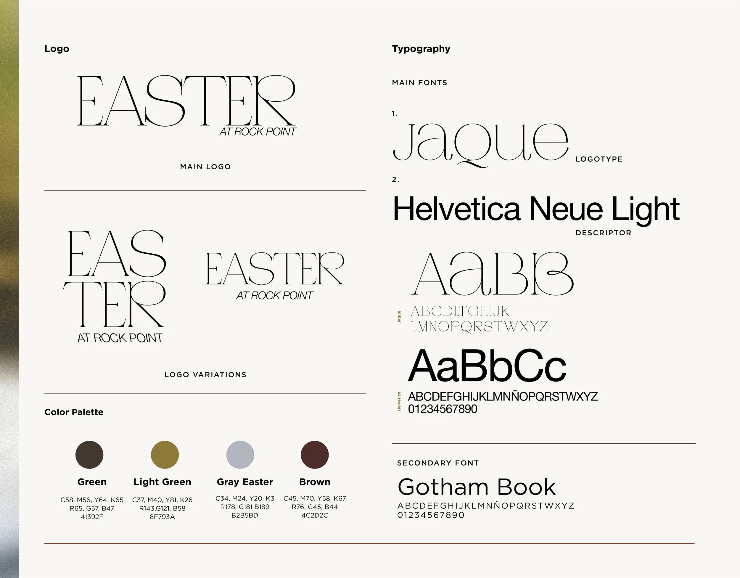
the design dna
This Easter brand guide set the visual tone for the season, defining the color palette, typography, and font system used across all Easter touchpoints. The look balanced warmth, celebration, and clarity—making it easy for teams to create cohesive, on-brand assets while keeping the Easter message front and center. Designed to be both playful and practical, the guide helped ensure everything felt unified throughout the season.
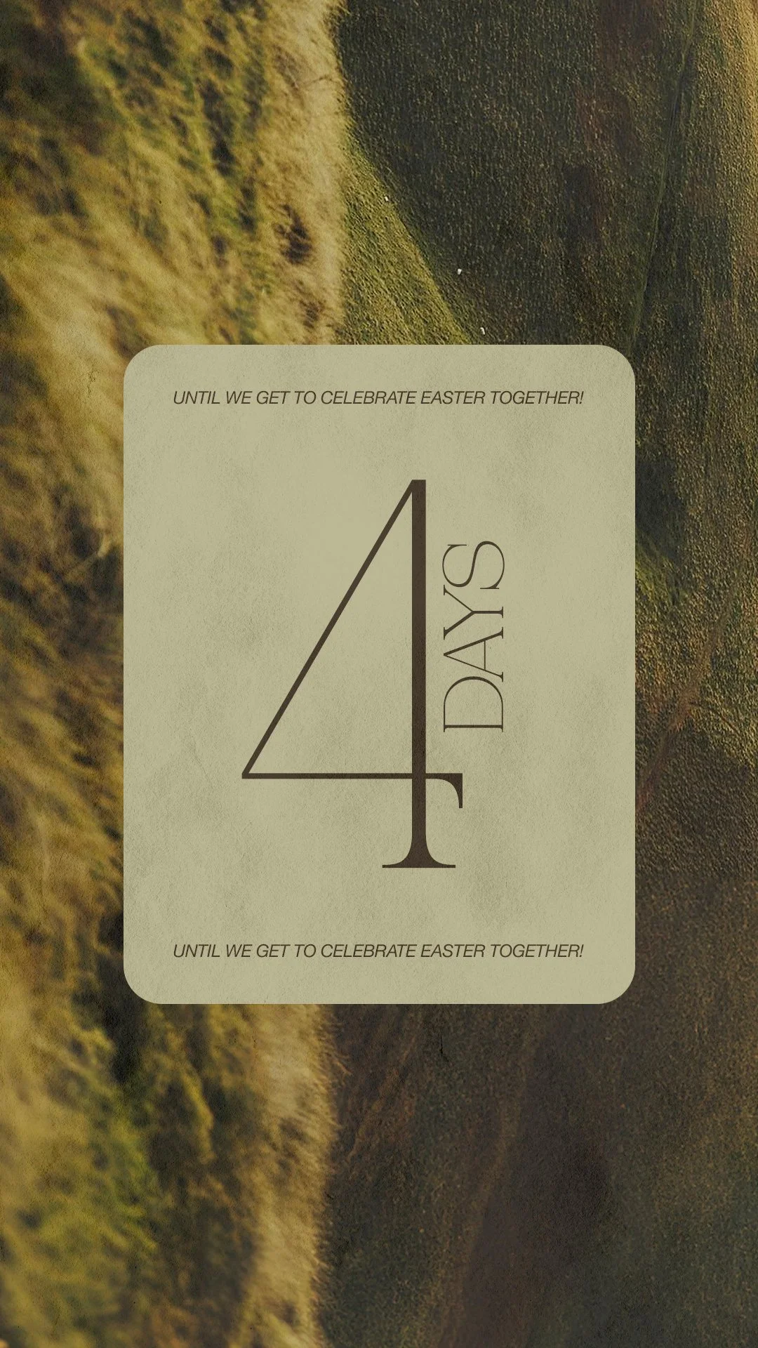
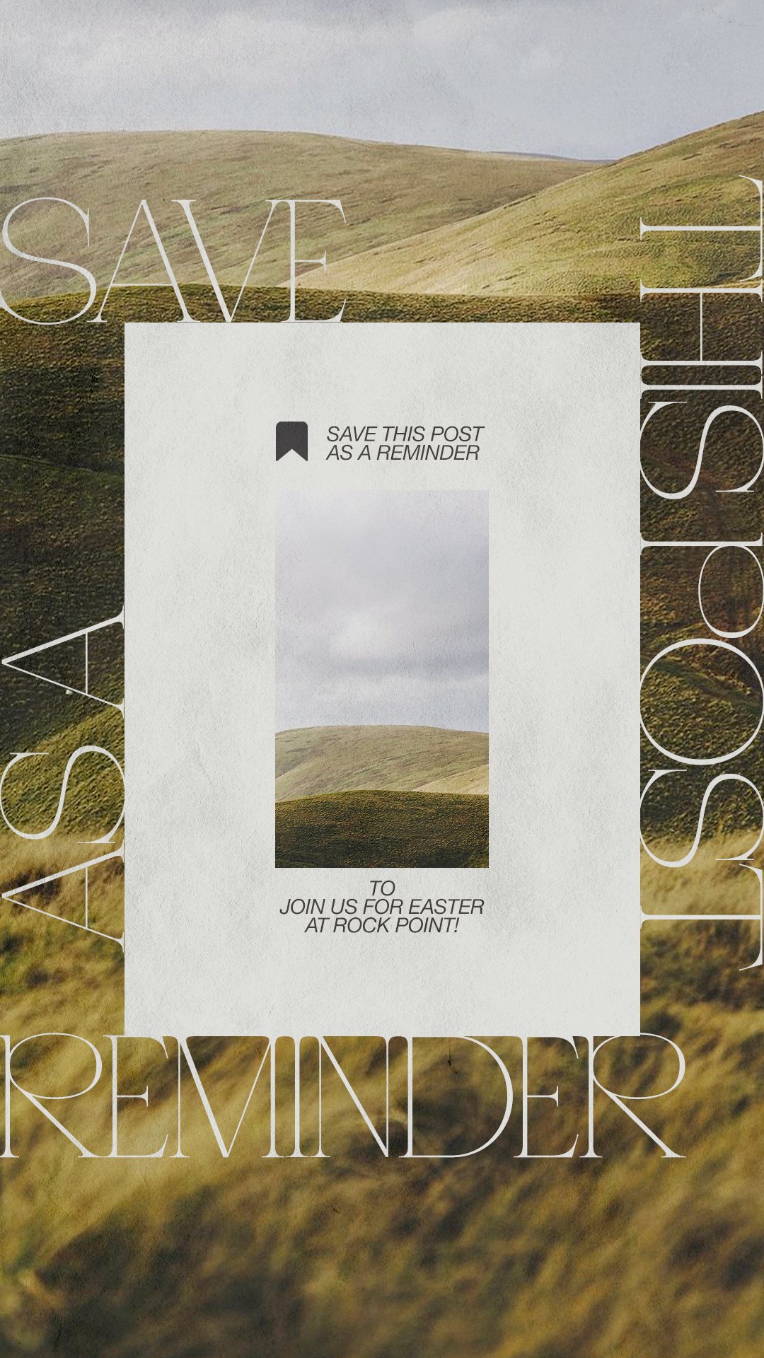
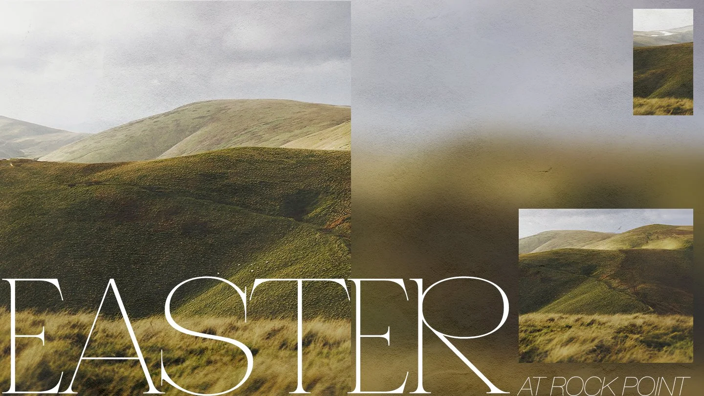
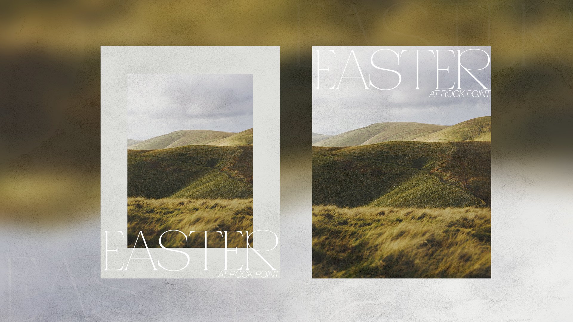
The Easter look, applied. These assets show how the brand came to life across real touchpoints, with colors, type, and overall vibe working together to create designs that feel engaging, intentional, and unmistakably on-brand.
brand in motion